How to Read Candlestick Patterns?
How hard is reading Candlesticks?
At a fundamental level, blockchainThe blockchain is a digital ledger that records transactions in a secure and decentralized manner. Think of it like a shared spreadsheet that is constantly... products are more difficult to grasp compared to traditional financial instruments and fiatFiat refers to any government-issued currency that is not backed by a physical commodity, such as gold or silver. Examples of fiat currencies include the... money. However, on the trading pit, they’re all the same — both government bonds and BitcoinBitcoin is like a digital treasure that you can use to buy things online. It's like having a secret code that only you know, and... require precisely defined trading strategies for a fruitful outcome.
To develop a viable strategy, you should give great emphasis on learning how to read market signals at the very beginning of your trading quest. Understanding those signals can sometimes be a question of profiting from or losing your investment. Unfortunately, you’ll notice that right after the first bearish frenzy in your career as an active trader.
To increase traders’ chances of success, the investment market “sells” such price signals and alerts in the form of charting systems, most common of which are:
- Line charts;
- Bar charts;
- Candlestick charts.
In this article, we’ll focus on candlesticks as they have turned out to be a favorite among crypto traders because of their visual appeal and comprehensive nature.
The Origin of Candlesticks
Interestingly enough, candlesticks actually originated in the Japanese rice market and have been technically adjusted throughout the years to fit even the most sophisticated trading platforms.
In short, a Japanese trader developed a basic mechanism using two different colors to help traders identify the price movement of rice based on the short-term behavior of its price levels.
The American analyst Steve Nison was the first who presented the candlestick methodology to the West in his book Japanese Candlestick Charting Technique. The name comes from their rectangular shape and long lines (wicks) that indicate the price actionAs a trader, price action refers to the movement of the price of a cryptocurrency over time. It's the study of how the price changes... during a certain time period.
What Are Candlestick Patterns?
Candlesticks are a method of visually analyzing and plotting asset prices by representing traders’ emotions with different colors based on multiple parameters. Similar to line and bar graphs, candlesticks show time through the horizontal axis and the asset price on the vertical one.
Moreover, candlesticks give information about the asset’s price movement and the current market attitude towards the asset within a predefined time span.
Reading Candlestick Chart Patterns
At first sight, the overall visual presentation of the candlestick chart may appear a bit overwhelming to beginners. However, after developing a basic understanding of the given parameters, they all find the candlestick system rather an intuitive trading tool.
Time Intervals
The time interval of a candlestick can range to a great extent depending on the settings of the trading platform itself. The default setting is usually 24 hours, but in most cases, these charts come with the option for manual adjustment — from 15 minutes to a decade — depending on the trader’s individual strategy. Some chart designs even allow users to combine a few timeframes for simultaneous views of both day-trading activities and long-term strategies.
Bear in mind that the crypto market operates 24/7, so we consider the starting point of the timeframe an open price while the endpoint is what the candle labels as the close price.
Price Position
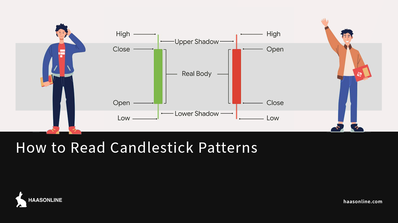
The wickIn trading charts, a wick is a line that extends above or below a candlestick body. It represents the highest and lowest price points reached... feature of the candlestick stands for the highest and lowest asset price during a pre-defined timeframe. Accordingly, the wick bottom shows the lowest price during that time, while the top is the highest price at which the asset is traded.
Together with the open and close price parameters, the price position gives the OHLC (open/high/low/close) value of the candlestick, whose ratio places the candlestick at a certain height on the graph.
The gap between the open and close price draws the candlestick body, while the gap between the body and the top or bottom endpoint is what we call a shadow or wick.
Candlestick Colors
You’ll find the body of candlesticks colored either in red or green. While red describes a negative price trend, green indicates an overall positive price movement. Interestingly enough, the choice of colors nowadays is on par with the basic UI principles of color psychology. Back in the 18th century, positive and negative market movements were shown in white and black, respectively. Even today, some traders prefer the original color pattern, which is also an adjustable feature on some trading software packages.
How Many Candlestick Patterns Are There?
The best way to improve your candlestick “reading skills” is by going through familiar patterns that traders use as a learning resource for popular market trends. Placed in a particular time sequence, candlesticks ultimately form patterns that provide relevant signals, enabling both buyers and sellers to make investment decisions without an emotional impact.
In the most general sense, these patterns can be either bearish or bullish. Bearish patterns signal downward movements, while bullish candlesticks usually appear after a downtrend to “herald” an upcoming positive price movement.
Depending on how many candlesticks the candle patterns consist of, there can be single, double, or triple patterns. We’ve listed the most powerful pattern examples that have found application in the fast-moving crypto market. Their names are pretty descriptive so that you can easily identify which one is bearish and which is bullish.
Long Upper and Lower Shadow
The upper shadow usually indicates a bearish trend, which means traders are getting ready to sell their assets and profit. On the other hand, a long lower shadow suggests a bullish movement gradually pushing prices up. The larger the shadows, the more indicative the pattern is.
Doji Candle
A Doji candle either lacks or has a tiny body, as the open and close prices are nearly identical. The “Doji” name comes from the Japanese word for “error” which in this context signals a market hesitation or a warning for a price reversal. During Doji, traders shouldn’t initiate any long or short positions until a new pattern of candles appears on the graph.
Umbrella
Umbrella candles feature a long bottom wick and can be red or green. The red umbrella is called a hammer and indicates that your crypto is facing a critical purchase action but that its price may get back on track very soon. Contrarily, green umbrellas imply that sellers are in the mood for cashing out. The green reversing cycle is called a hanging man.
Piercing Line
This two-candlestick pattern has a long red candle accompanied by another long green candle. The piercing line comes along during a downtrend bottom or even a total drawback. The pattern implies purchasing pressure because of the huge gap between the close price of the red candle and the open price of the green candle. More concerning is the high open price of the green candle as it suggests a strong bearish downtrend.
Morning Star
The star is one of the most complex patterns due to the three different candles it contains to build a meaningful image: a long red candle next to a short-body candle and a long green one. In most cases, the middle candle doesn’t overlap with the surrounding ones. The morning star signalizes a new bullish market after the selling pressure has gradually declined.
Other popular candlestick patternsCandlestick patterns are a common tool used in technical analysis to predict future price movements in financial markets. The patterns are formed by a series... include Bullish/Bearish Marubozu, Bullish/Bearish Engulfing,
Bullish/Bearish Harami, 3 White Soldiers, 3 Black Crows, and many more.
Final Thoughts – How Accurate Are Candlestick Patterns?
As a style of data visualization, candlestick charting is remarkably accurate. It provides users with a very detailed set of information about the price of the desired asset during a certain time period.
However, If you’re wondering whether and to what extent candlestick patterns are accurate for predicting future market trends, the answer is — not enough to fully rely on their interpretation when making an important business decision. Nonetheless, well-established patterns have proven to be life-saving caution signs in wild bearish times, even though history doesn’t necessarily repeat itself with volatile markets.
Finally, letting candlestick patterns take a role in developing your business strategy is always a good idea but only when integrated with other relevant analytic indicators and trading bots.


